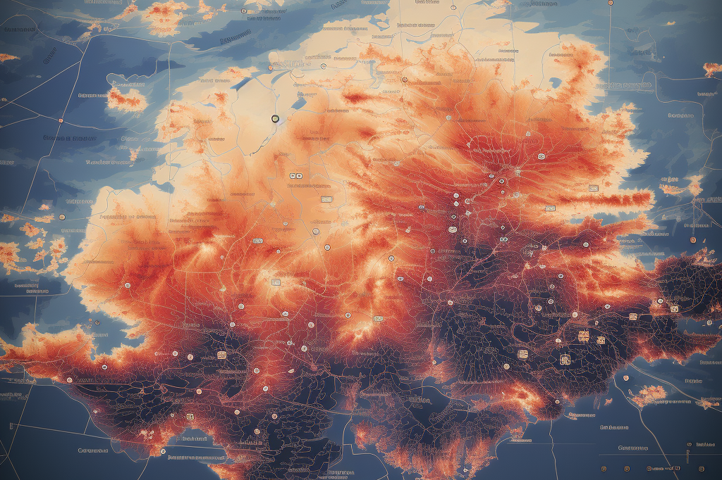
A spherical LED screen is very different from a traditional flat LED display. On a normal screen, text can be placed almost anywhere inside the frame. On a sphere, however, the curved surface changes how letters look from different viewing angles.
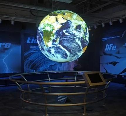
Put text too high or too low, and it may become stretched or compressed. Put important information on only one side, and people standing behind the sphere may never see it.
For this reason, good spherical LED screen text placement is not simply about choosing a nice font. You need to consider the shape of the sphere, audience position, installation height, viewing distance, and content mapping.
For most projects, the middle or equatorial zone of the sphere is the safest area for important text.
Imagine a horizontal line running around the widest part of the sphere. The area around this line usually provides better visibility than the top and bottom poles.
This makes it suitable for:
For example, if a retail store uses a spherical LED screen to promote a new product, the product name should normally appear around the middle viewing area rather than close to the top.
This helps reduce distortion and makes the message easier to read as people walk around the display.
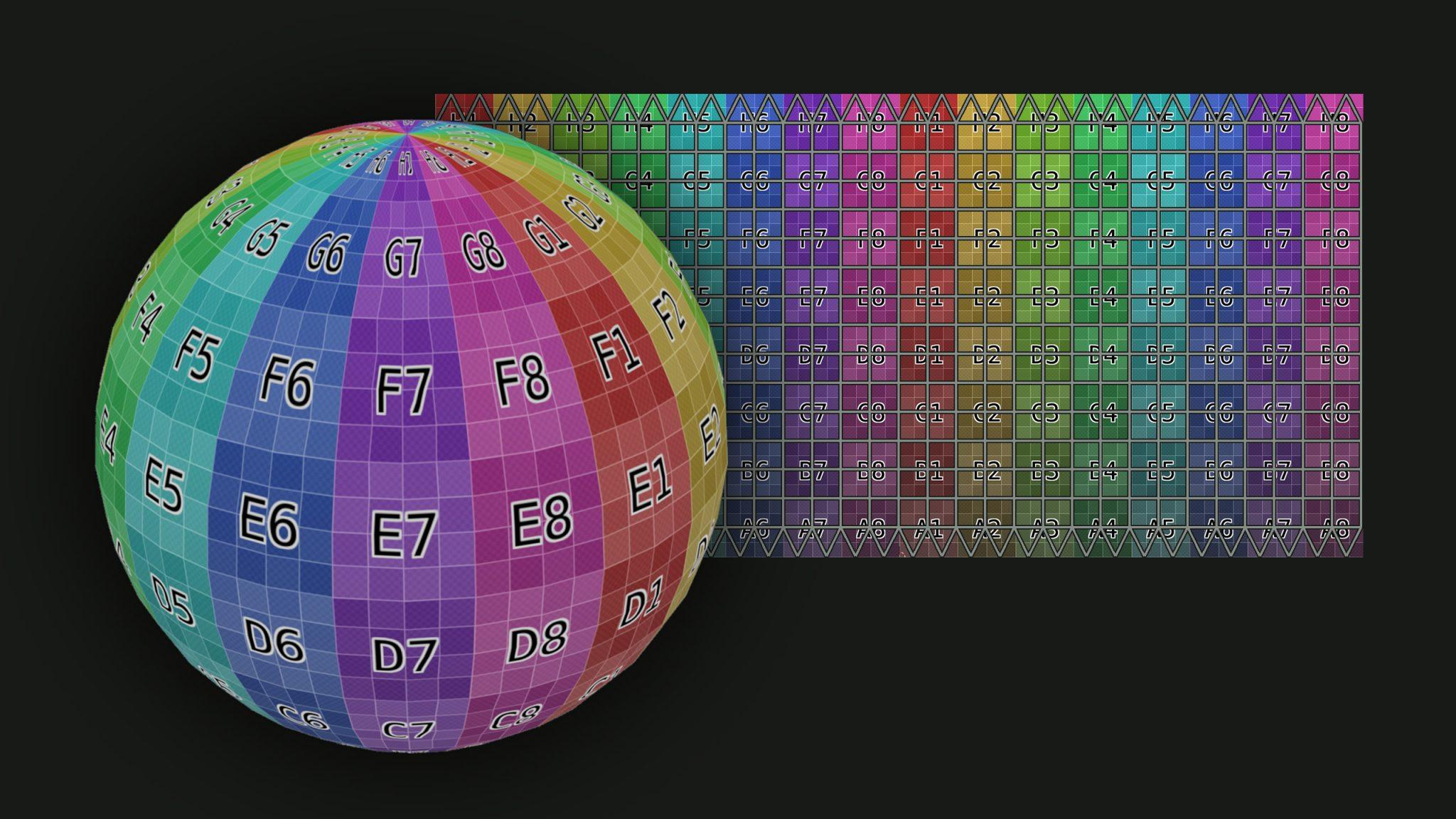
The top and bottom of a sphere are difficult areas for text.
When flat content is mapped onto a curved spherical surface, pixels are distributed differently across the display. Content close to the poles may appear compressed, stretched, curved, or difficult to recognize.
A logo may still work in these areas if distortion is part of the visual design. Long text usually does not.
For example:
“NEW PRODUCT”
is much easier to handle than:
“Discover Our Latest Product Collection Today.”
Keep essential information away from the extreme top and bottom whenever possible. These areas are better for backgrounds, patterns, particles, animation, or decorative graphics.
No.
The equatorial zone is a useful starting point, not a fixed rule.
The best position depends heavily on how the LED sphere display is installed.
If a small sphere is installed close to eye level, text around the center usually works well.
For a large sphere suspended high above visitors in a shopping mall, exhibition hall, or event venue, the main text may need to move slightly downward so people below can see it comfortably.
For a sphere installed low to the ground, the readable area may need to move upward.
A useful rule is:
Place important text near the audience's natural viewing area, while keeping it away from the poles.
This is why installation height should be confirmed before the final content is produced.
A major advantage of a ball sphere LED display is that people can see it from different directions.
But this also creates a problem.
If a brand name appears only once around the sphere, only viewers standing in the right position may see it clearly.
For important messages, consider repeating the text around the circumference.
For example, a short brand name can appear two, three, or four times around the sphere. As visitors walk around it, they have more opportunities to see the message without waiting for the content to rotate.
However, avoid filling the entire sphere with repeated text. Too much information can make spherical content look crowded.
A sphere is better for visual impact than for reading paragraphs.
Short text is usually more effective.
Instead of:
“Visit our booth to discover our latest range of innovative LED display solutions.”
Try:
“Discover Our New LED Displays”
or:
“Visit Us at Booth A20”
Short messages remain visible for longer and are easier to understand from different angles.
This is especially important when the sphere is installed in shopping malls, exhibitions, airports, museums, hotels, or other locations where people may only look at the screen for a few seconds.
Font choice is just as important as text position.
Decorative fonts may look attractive on a computer monitor but become difficult to read once wrapped around a sphere.
For most commercial content, use:
Thin strokes and very small text should be avoided, especially when viewers are several meters away.
Pixel pitch also matters. A fine-pitch LED sphere can reproduce smaller details more clearly than a larger-pitch display.
AiDisplay's spherical LED screen range, for example, includes different pixel pitch options for different sphere sizes and viewing requirements. Choosing the screen specification and designing the content should therefore be considered together.
Before deciding the final font size, ask one question:
How far away will the audience be?
A 1-meter sphere viewed from two meters away has very different content requirements from a large globe display viewed across a shopping mall atrium.
As viewing distance increases:
Do not judge text only from a laptop screen. What looks oversized during content production may be completely appropriate when viewed on the actual LED sphere.
Never rely only on a flat preview.
A design may look perfect as a rectangular file but very different after spherical mapping.
A better workflow is:
Create content → map it to a sphere → preview it in 3D → test it on the actual LED display → check from several angles → adjust
During testing, walk around the sphere and check the text from the front, sides, and different heights.
Pay particular attention to:
Small adjustments at this stage can make a major difference to the final result.
One common mistake is designing content exactly as you would for a rectangular LED screen.
Other problems include placing long sentences near the poles, using fonts that are too small, showing a brand name on only one side, ignoring installation height, and testing the video only on a computer.
Another mistake is trying to use every part of the sphere for information.
You do not need to.
Leave some areas for visual effects. Give important text enough space to stand out.
The best place for text on a spherical LED screen is usually around the middle or equatorial viewing zone, where distortion is easier to control and viewers can read the message comfortably.
However, there is no single position that works for every project.
Sphere diameter, installation height, pixel pitch, viewing distance, audience direction, and content mapping all affect the final text position.
Keep important text away from the poles, use short messages and readable fonts, repeat key information when necessary, and always test the finished content on a spherical preview or the real display.
For projects that require different diameters, pixel pitches, indoor or outdoor configurations, AiDisplay provides customizable spherical LED display solutions for advertising, exhibitions, shopping malls, hotels, events, and other creative installations.
The middle or equatorial area is generally the safest position because it provides good visibility while reducing severe distortion.
Small decorative elements may work, but important text should normally stay away from the top and bottom poles because these areas are more likely to produce visual distortion.
 Hot News
Copyright © 2025 by Shenzhen Ai Display Technology Co., Ltd - Privacy policy
 EN
EN